Enhanced Navigation & Custom Icons
Pattern and layout updates across app
Led UX explorations focused on simplifying and enhancing Drip’s navigation experience for a more intuitive user flow across our entire app.
Client
Drip
Type
Product Design
Year
2025

Problem
Summary
As Drip’s product expanded, its navigation and page header system became increasingly fragmented, creating an interface that felt cluttered, inconsistent, and harder to understand than the underlying product actually was.
Clarity & Readability
Users struggled to scan and interpret pages because icons lacked a cohesive visual language and page header layouts varied significantly across the app, making the interface feel visually noisy and difficult to read.
Consistency & Predictability
Inconsistent navigation patterns and header structures forced users to relearn the interface from page to page, reducing predictability and increasing cognitive load when moving through the product.
Visual Hierarchy & Focus
The absence of a unified hierarchy made it difficult for users to understand what actions or information were most important on each page, contributing to a sense of clutter rather than clarity.
Systemic Gaps
At a system level, navigation and page headers were not governed by a shared structure or set of design rules, resulting in fragmented layouts, inconsistent iconography, and weak alignment with the broader design system.
User Impact
These inconsistencies eroded user confidence, made everyday tasks feel more complex than necessary, and weakened trust in the product’s overall quality and cohesion as it scaled.


Deliverables
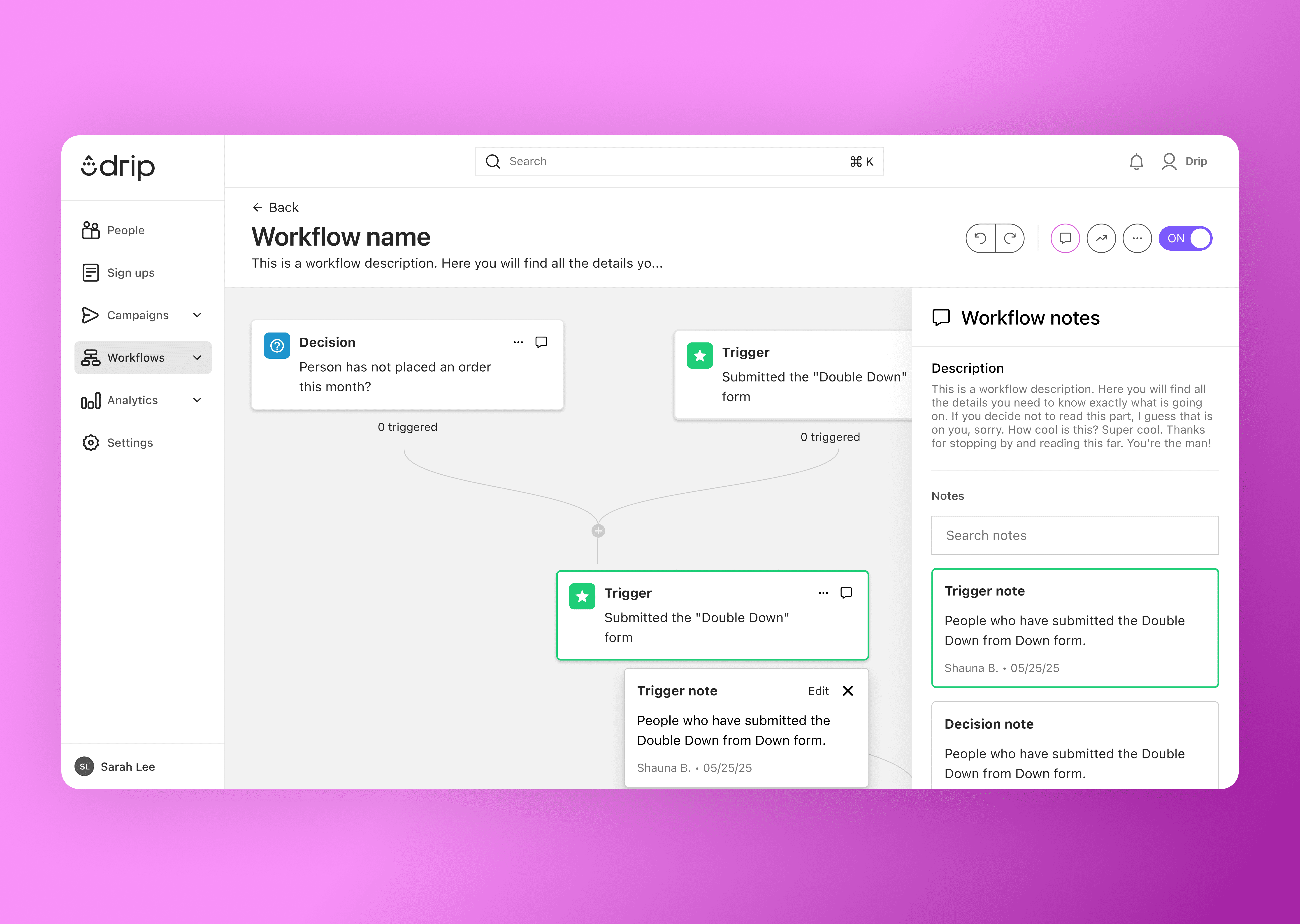
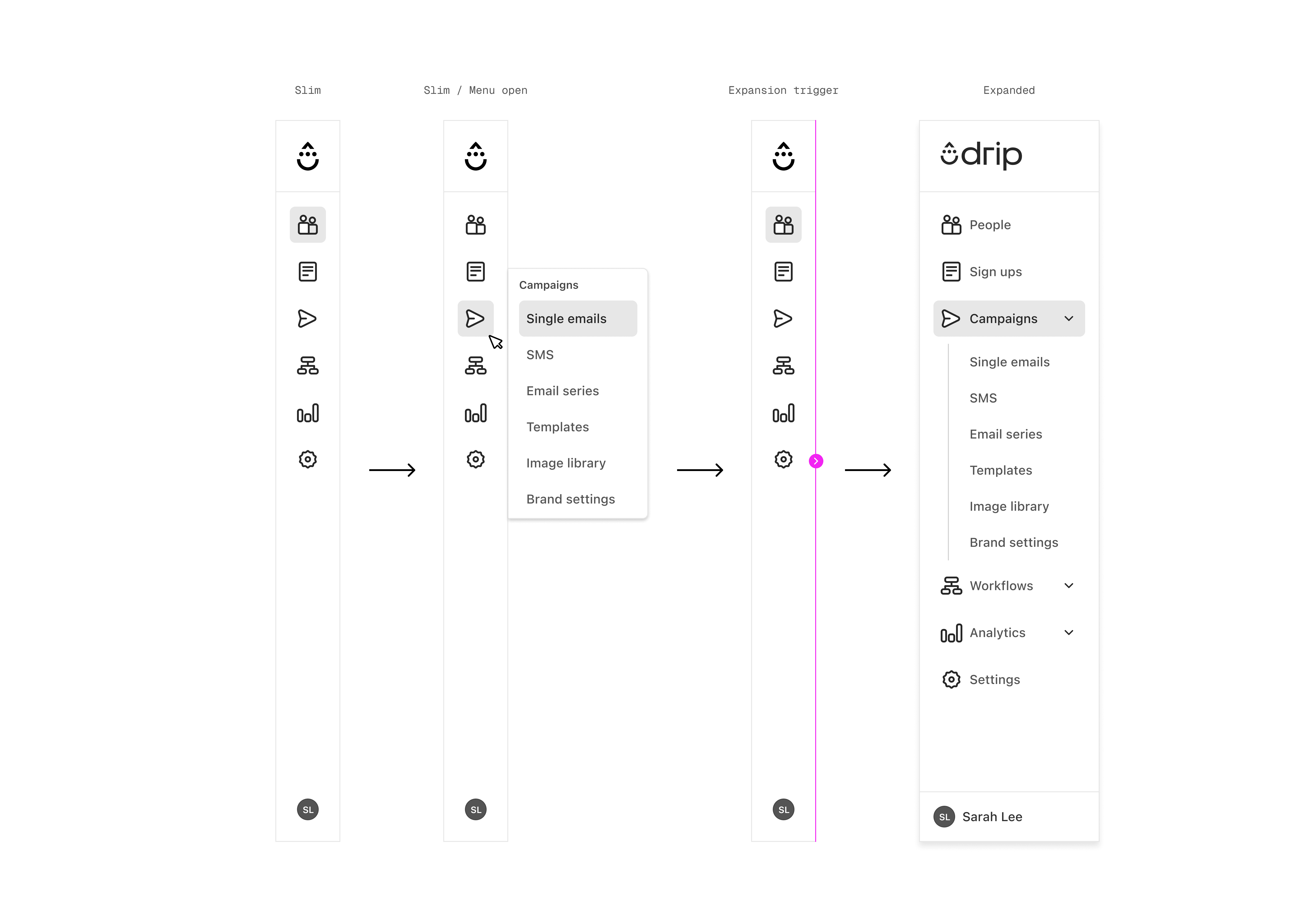
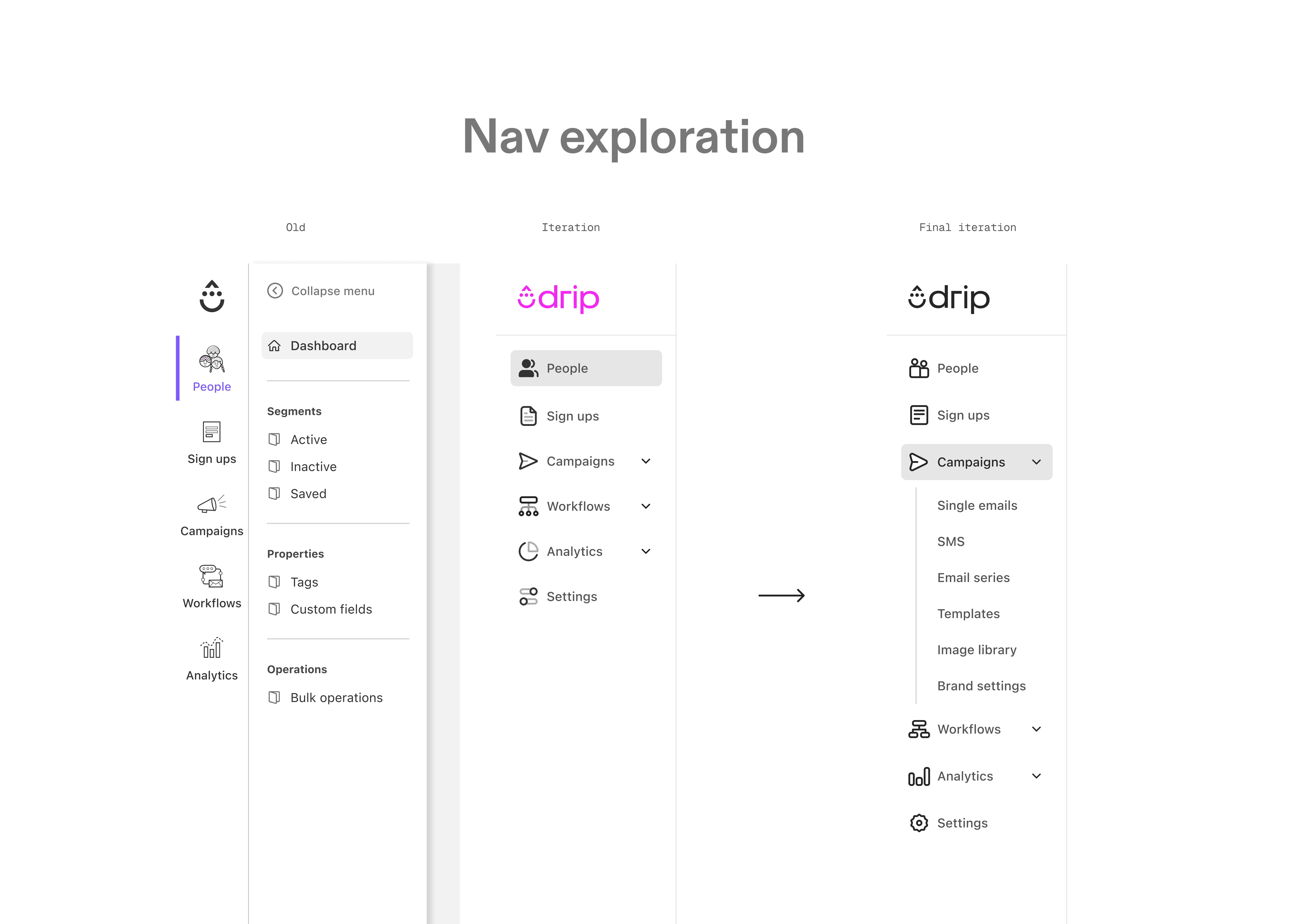
To address the fragmentation in Drip’s navigation and page headers, we began with a comprehensive audit of the existing navigation patterns and iconography to understand where inconsistencies and visual noise were occurring across the product.
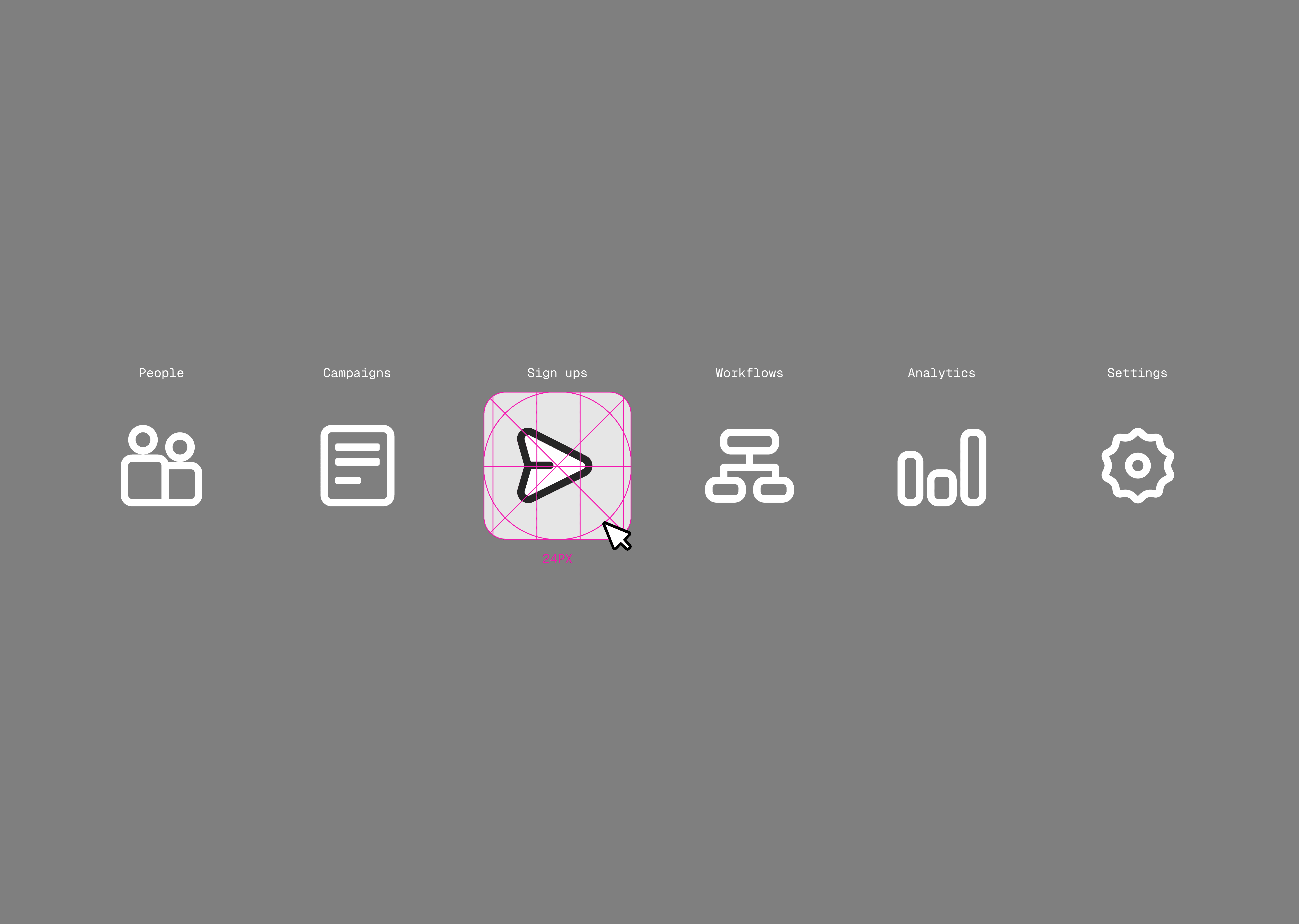
Insights from the audit informed a series of design explorations that tested multiple icon styles—including hard-edged, rounded, and single-tone treatments—to find a balance between precision, warmth, and visual cohesion that aligned with the broader design system.
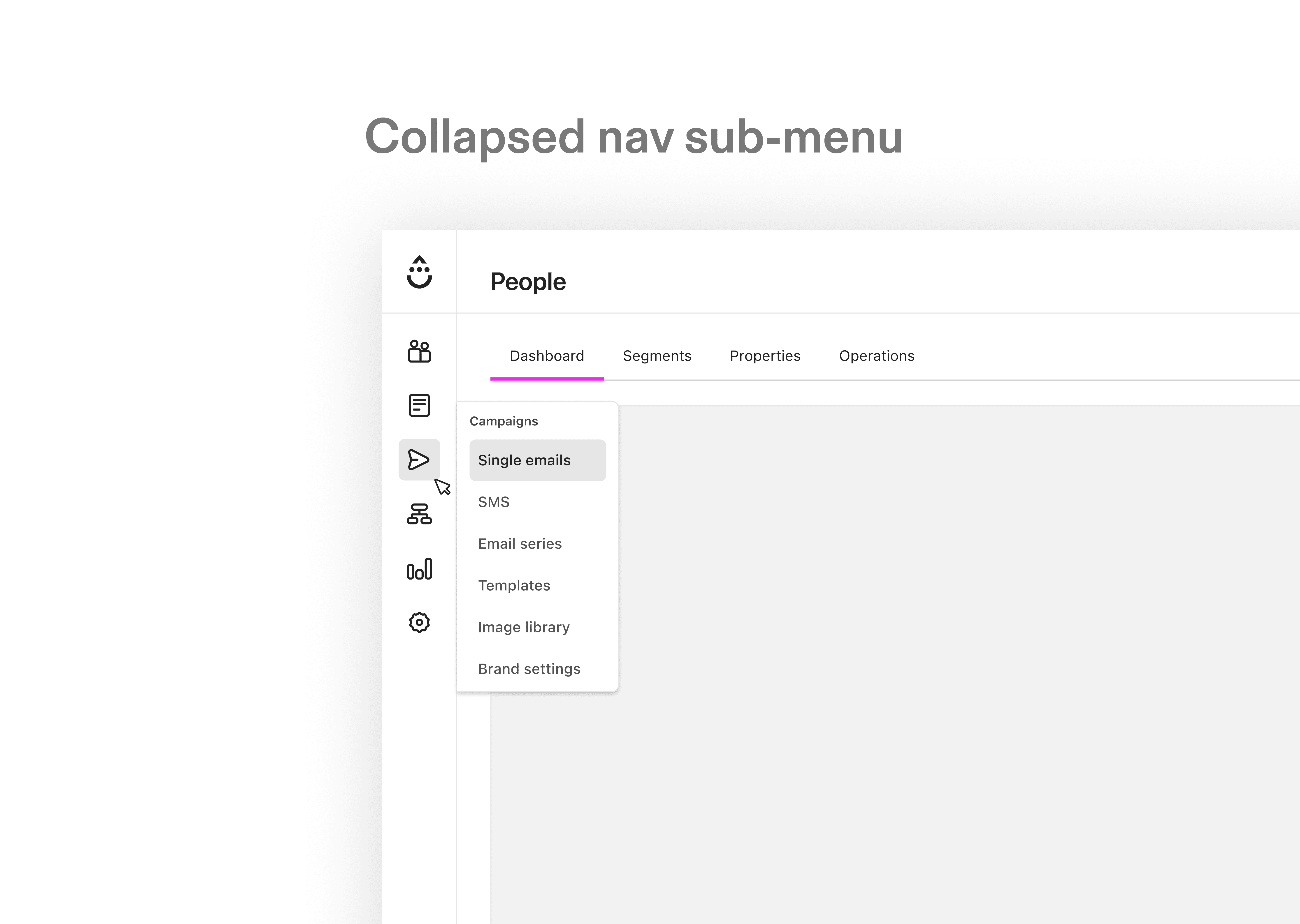
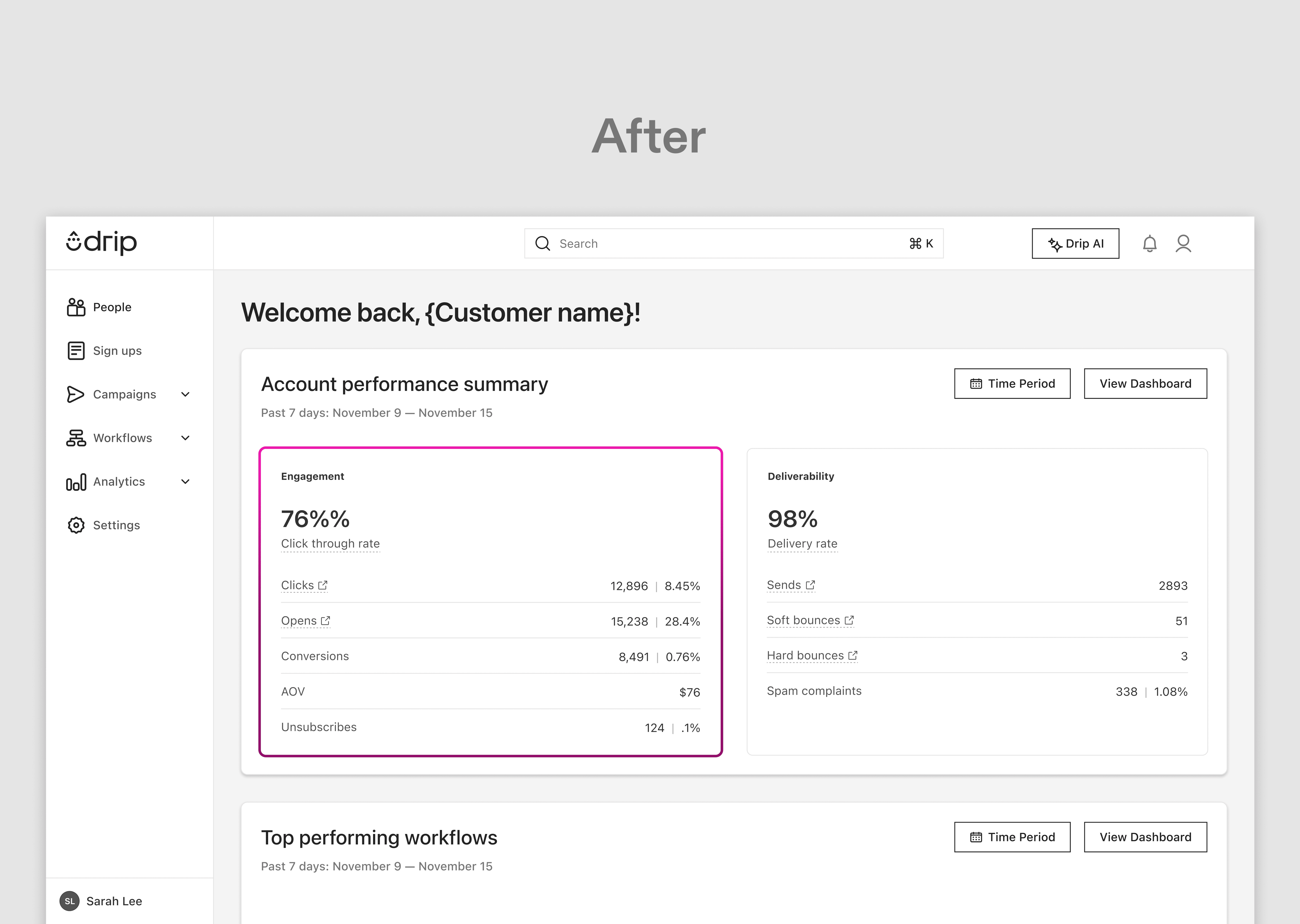
These explorations led to the establishment of a unified icon system that improved readability, reduced visual noise, and created a more cohesive visual language across the app.
In parallel, the primary navigation was restructured with cleaner spacing, simplified groupings, and collapsible menus for content-dense areas such as Campaigns and Workflows, resulting in a more predictable and scannable navigation experience.